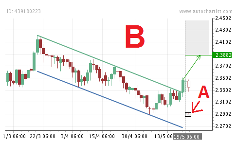
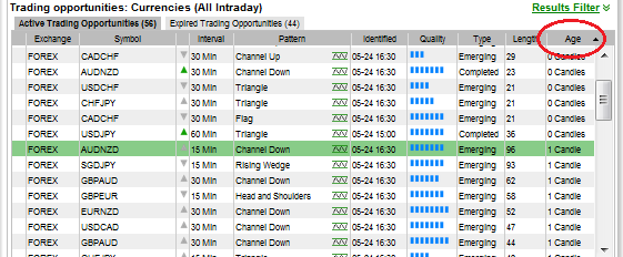
The Time Scale and Age of Patterns

The central idea behind this short article is to show you how important it is to understand the time frame that is relevant to any pattern, and that if you do not understand this, it could totally wreck your trading success. Make sure you “get it” before you put any money on a pattern!

Let’s start by looking at an illustrative example. Take these two chart patterns. Both were identified on Forex currency pairs, both are Channel Down patterns, both have completed, and both are still active trading opportunities. They have very similar shapes, with similar looking target regions.


But let us look at just how different these two patterns really are. In order to evaluate the differences, let’s look at each pattern’s description in more detail:


Pattern A has length 52, meaning there are 52 candles in the pattern, which is only 3 candles more than pattern B which has 49 candles. However, focus for a minute on the “Interval” value, third from the top. Pattern A has a 15-minute interval, while pattern B has a 1440-minute (1 day or 24 hour) interval.

This means that pattern B spans over 49 days, with at least 6 weekends in between, so it translates to a minimum of 61 days – two whole months! All the while pattern A started forming 52 x 15 minutes ago, which is a mere 13 hours ago – early this morning.

If we had to overlay the two patterns using a normalized time scale, they would look like this:


Pattern A has little more than 1% of the length of pattern B. Also, pattern A is expected to be tradable for a few more hours, while pattern B can be tradable literally for weeks. This has a very significant impact on how one should view each of the two potential trades!

Therefore always be sure to look at the length of a pattern in conjunction with the time interval of the graph.


In the grid in the Autochartist application we have added the “Age” column, which is the age in candles, containing the number of candles that have completed since the pattern was identified. By default the grid is sorted firstly on Age, secondly on Time Identified and lastly on pattern length. The purpose of this is to keep the freshest trading opportunities at the top of the list, since they really hold the most potential.

As could be seen from the afore going discussion, patterns can span over vastly different time scales, and longer term patterns can also remain fresh for far longer than the short term patterns. Therefore it would make sense for long term patterns to move down this list of “freshness” much more slowly than patterns that only span a short time.

DISClAIMER: The Autochartist service includes chart pattern identification in respect of foreign currencies, commodities, equities and stocks. There are potential risks relating to investing and trading. You must be aware of such risks and familiarize yourself in regard to such risks and to seek independent advice relating thereto. You should not trade with money that you cannot afford to lose. The Autochartist service and its content should not be construed as a solicitation to invest and/or trade. You should seek independent advice in this regard. Past performance is not indicative of future performance. No representation is being made that any results discussed within the service and its related media content will be achieved. All opinions, news, research, analyses, prices or other information is provided as general market commentary and not as investment advice. Autochartist, MDIO Software, their members, shareholders, employees, agents, representatives and resellers do not warrant the completeness, accuracy or timeliness of the information supplied, and they shall not be liable for any loss or damages, consequential or otherwise, which may arise from the use or reliance of the Autochartist service and its content.